ShopDreamUp AI ArtDreamUp
Deviation Actions
Suggested Deviants
Suggested Collections
You Might Like…
Featured in Groups
Description
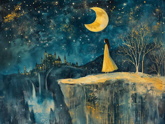
Wow this one took a really long time (mostly because of school and other projects I've been working on), but it's finally done! I worked really hard on trying to get bold colors with colored pencil, and for the most part I'm pretty happy with how it came out. Let me know what you think!!
Find me on:
Facebook
Tumblr
Instagram
More like this piece:


Find me on:
Tumblr
More like this piece:


Image size
3286x2832px 8.01 MB
Make
Canon
Model
Canon PowerShot ELPH 100 HS
Shutter Speed
1/25 second
Aperture
F/2.8
Focal Length
5 mm
ISO Speed
800
Date Taken
May 4, 2015, 9:14:40 PM
Sensor Size
5mm
© 2015 - 2024 memetzger
Comments34
Join the community to add your comment. Already a deviant? Log In
This has a very nostalgic look to it, like it would befit the cover of a progressive rock album from the early 1970s (like for the band, Yes). Or an illustrated children's book. It's very vibrant and the forms on the page are absolutely appropriate for a fantasy setting.
The composition is decent; the eye is drawn to the figure in the foreground, although the placement of the patch of flora to the left of the figure and the lack of contrast between the two elements muddies the border between them.
The atmospheric distortion was well executed. The scenery does appear to fade away as if one is viewing it from a distance.
The lack of blending in the pencil strokes on the grass makes the ground appear hard and unforgiving rather than soft and grassy, but the color choices are solid for the surface.
The stone walkway appears to differ greatly in its width; the portion in front of the figure that rolls over the edge of the near hill is narrower than that which is meant to appear farther away, which interferes with the perspective.
This would have benefited from more shadows under the trees and more contrast overall between the different areas that demand more light and shade. The trees in the mid ground appear flat.
Not a bad drawing. It's definitely eye catching and tells a story.


